 |
Pilchuck Camera Club's
2010 Image
of the Year, Assigned Subject & Wildflower Winners
Judging performed by Tahlequah Camera Club, Tahlequah, Oklahoma
The images on this page are the property of the photographer
Please Do Not Reproduce
| 2010 Image Of The Year Competition | |
|
1st - "Sleeping Otter"
by Shirley Stitch Peace, perfect peace… it was amazing the otter didn’t wake up as you were taking the picture. The picture has excellent, sharp focus & a nice reflection without being too busy. Everything from the wet hair to the closed eyes & the paws folded as if in prayer paints a story of peace in a world of wars, fighting, and sorrow for many. This image calls us into the otter’s world of peace, if even for a brief time. The judges all wish they had taken that picture! 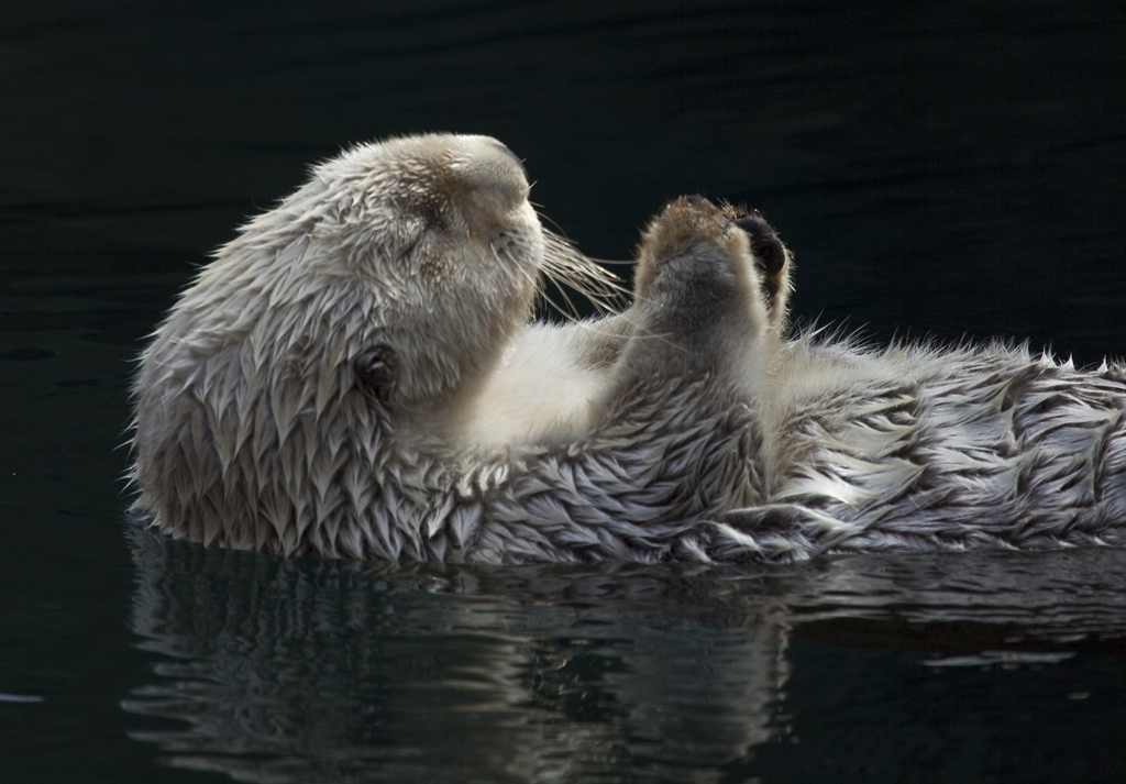 |
|
|
2nd - "Bodie Barn"
by Kevin Siefke This image is beautifully framed; it is
sharp, and the patterns in the wood stand out well – very
nicely done. The
image brings us back to a time long past as it tells a story
of itself. One can easily imagine a farmer stepping out to
go to the barn.
The judges would have liked to seen the hot spots on the
left side of the framed house cloned out. 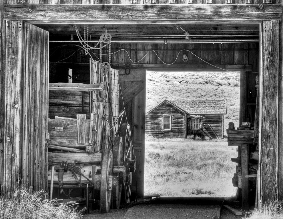 |
|
|
3rd - "Wolf’s Guenon"
by Bill Dewey
This is sharp as a tack! One can
almost count individual hairs on the monkeys. The eyes have
a good catch light, and the image tells a pleasant story of
the love & trust between them.
The background is soft and undisturbing.
We understand this is in the nature category, which
doesn’t allow the hand of man to be seen nor can Photoshop
be used on it if you are following PSA rules.
However, as the Owl image states it has a changed
background, we thought you might be able to clone out the
long hot spot directly behind the monkeys, which is
distracting. 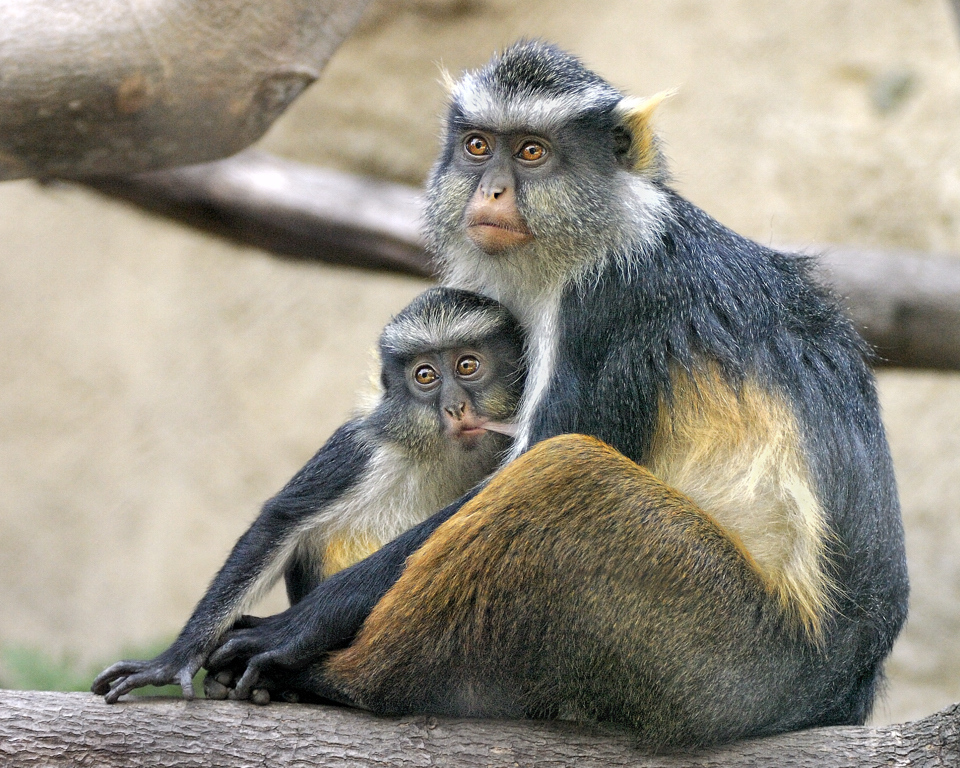 |
|
|
HM - "Ice Take Off; Sand Hill Crane"
by Bill Dewey
The details caught in this lovely bird
are outstanding. The picture is tack sharp, including the
eye. The lighting is good, and the well formed feathers on
the wing tip, which is slightly touching the ice, is well
placed with excellent movement seen.
The judges would have liked to have about an inch of
the top cropped off, so the bird stands out more than the
water. 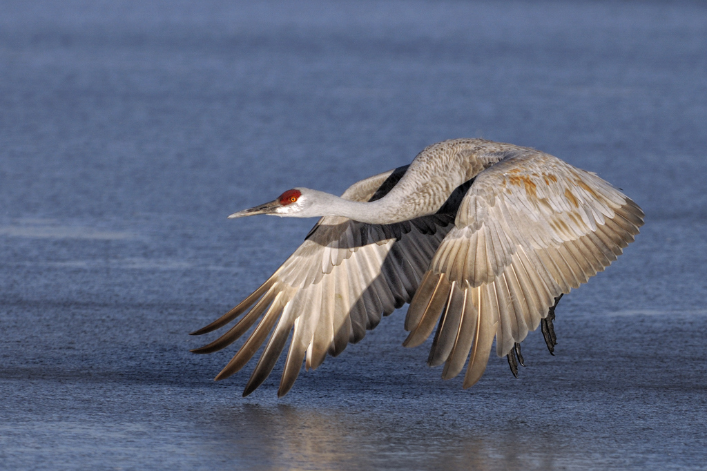 |
|
|
HM - "Space Needle"
by Steve Lightle This is excellent enough to be a post
card! The best time to take night pictures is just as the
sun is going down, while the sky still has just a touch of
blue, and you have done it well. It is well focused, and the
dark trees in front make a good solid base for the picture.
The judges would have liked to see the small white
light on the left side & the small orange light close to
center in the trees to be cloned out, if possible. 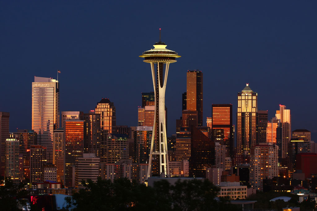 |
|
|
HM - "How You Doin’"
by Anna Rice The contrast of the feathers created a
beautiful pattern, and making it fill the frame makes it an
awesome impact with no background problems.
The judges thought that the beak and the top of the
comb appear to be slightly out of focus. 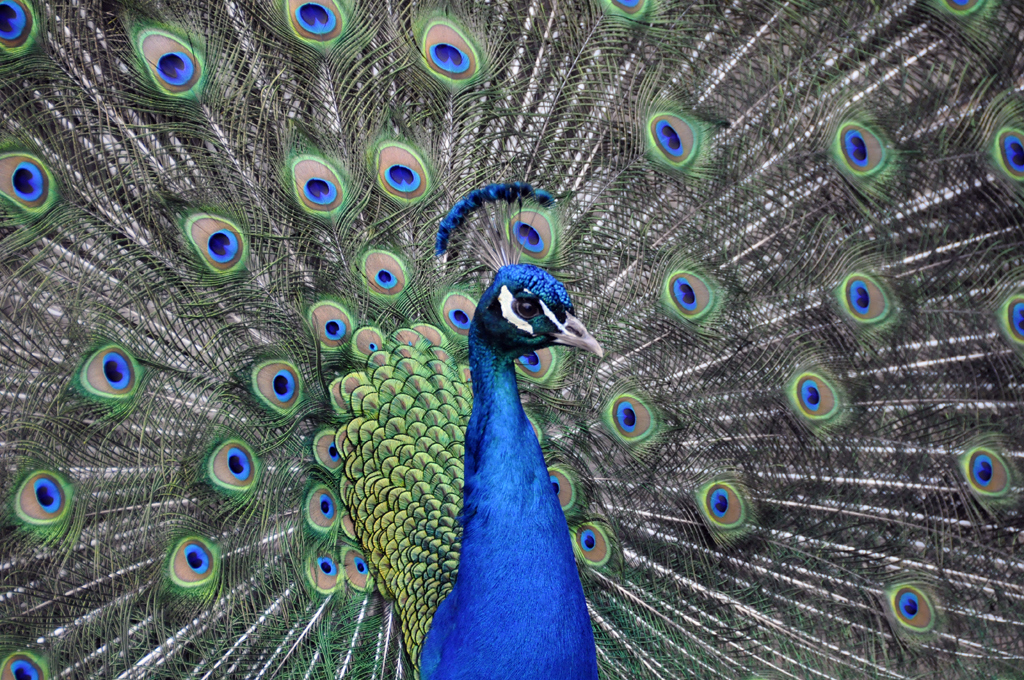 |
|
|
HM - "Changed Background (Owl)" by Jim Basinger ©
This is a superb image of an owl, and
very sharp. It
is well positioned on the tree, setting it in a proper
environment.
The feathers were well detailed.
The judges would have liked the background, although
beautiful, to be muted somewhat.
Our eyes were looking back and forth from the owl to
the lovely background instead of keeping our eyes on the
owl, which is the main point of interest. 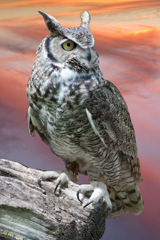 |
|
| 2010 Assigned Subject Competition - "Lines" | |
|
1st - "Frosted Grate"
by Kevin Siefke This is really unique; it is also very sharp, all the way out to the edges. The frost added a great deal of character, which really made the grate stand out. This image is technically excellent. 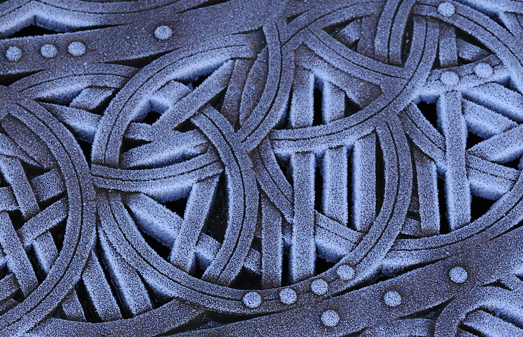 |
|
|
2nd - "Tulip Lines"
by Janet Wright The dark mountains covered by an angry
black sky gave a stark contrast to an entire field of
beautiful pink tulips basking in the sun. The color of the
tulips is exceptional, and you have great depth of field.
We’d like a bouquet of them! 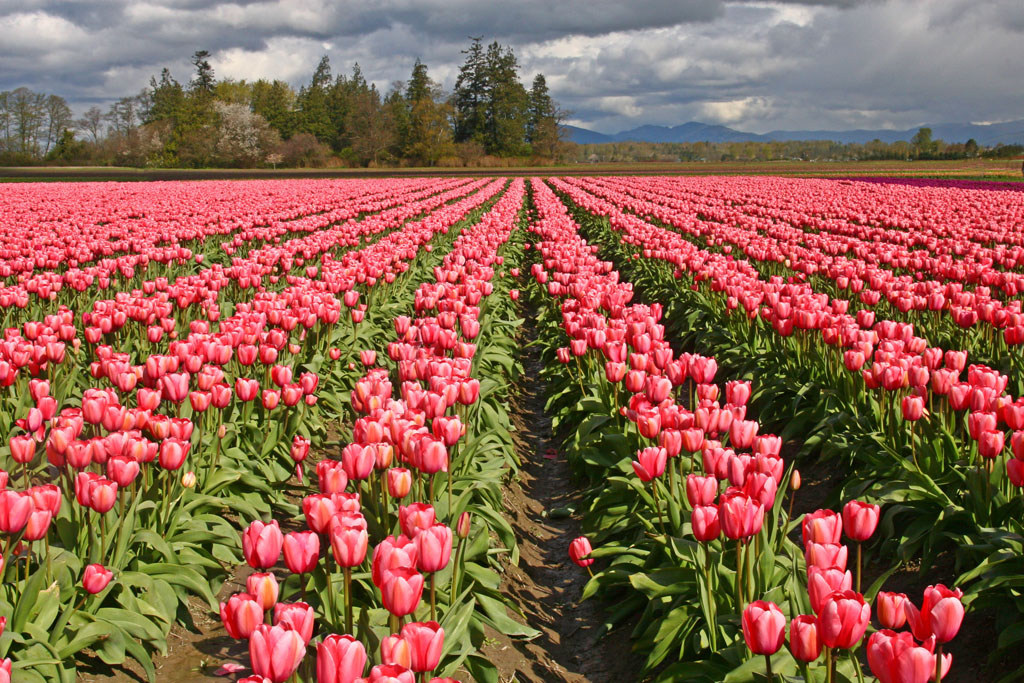 |
|
|
3rd - "On the Wall"
by Anna Rice
This most certainly covers the
subject, with lines intersecting with shadows of lines
filling the entire image.
Everything is completely sharp throughout the image.
The judges would like to have the left hand part of the
image cropped up to the black metal piece, thereby fully
focusing on all the long inner lines inside a frame, rather
than having the eyes rove from short, insignificant lines to
the major view of the longer lines.  |
|
|
HM - "Railroad Tracks"
by Renata Kleinert The leading lines were really great, as well as the wonderful depth of field. To top it off, it was as sharp as it could be. The judges really liked it as a good idea, pure, simple and to the point. Our concerns were that it looked over saturated with color, making the rocks look like pure turquoise and the cross beams were quite washed out white while the outer parts looked to be a darker brown. Coming from the Upper Peninsula of Michigan where copper is mined I know such rocks exist, but have never seen them to that great a depth of color. In addition, the buildings in the upper right are distracting. If you could either crop out at minimum the white ones or clone in more grass there it would help. The eye always goes to the lightest spots, and the white is particularly distracting. Still, its impact is instantaneous and very pleasing.  |
|
|
HM - "Palouse Rainbow"
by Janet Wright The somewhat darkened sky with wispy
clouds and the double rainbow was beautiful, especially in
such an outstanding background of gently rolling hills.
The sunlight was a
nice bonus. The tire tracks in the grass tell us a story,
leading us to know someone’s farm is off in the distance.
It gives a sense of peace.
The only thing the judges were concerned about was
the over saturation in the rainbow; nobody has ever seen so
dark a rainbow, especially the red, and it just didn’t fit
in quite right.
The angle taken was also well done.  |
|
|
HM - "Eternal Lines"
by Andrew Rice The arches were unusual, making good subject matter and the name is very fitting. The manner in which they do appear to go into eternity makes an excellent image. It would help if the center line in the arches lined straight up vertically rather than diagonally, but we understand there may be a problem in getting to the right spot to do so. 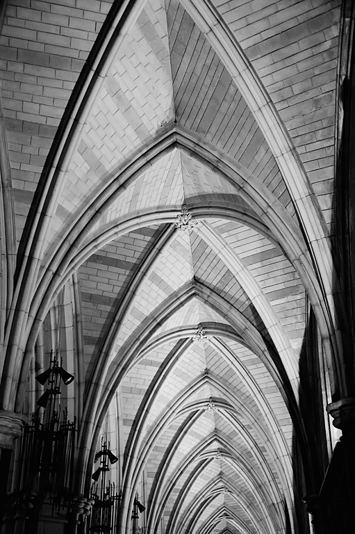 |
|
| 2010 Wildflower Competition | |
|
1st - "Foxglove 2010"
by Janet Wright Perfectly framed and tack sharp, even when blown up in size. The color is outstanding. The angle at which it is placed is excellent, making a superb leading line. This image is technically perfect. 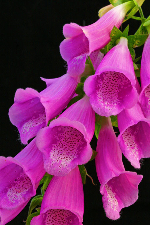 |
|
|
2nd - "Bittersweet 2"
by Janet Wright This sprig of flowers has a great leading line with lighting that is just right for this image. The color is wonderful with a good muted background and good lighting. The judges’ concern is that it isn’t sharp, but the immediate strong visual impact was enough to carry it over, accepting it as being quite artistic. 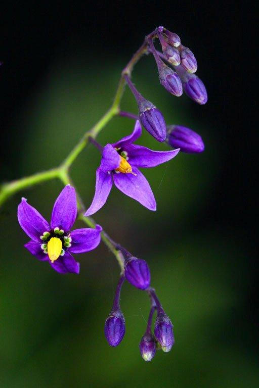 |
|
|
3rd - "Thistle"
by Kevin Siefke
This stunning flower has tiny white flowers within its
middle, each having a lovely light pink star on top of it.
It is so sharp that when blown up to a large size,
even the small flowers inside are sharp.
It has been shot at a good angle with a good depth of
field. The
judges would have liked to see just a little more space on
the sides, as it looks a bit crowded. 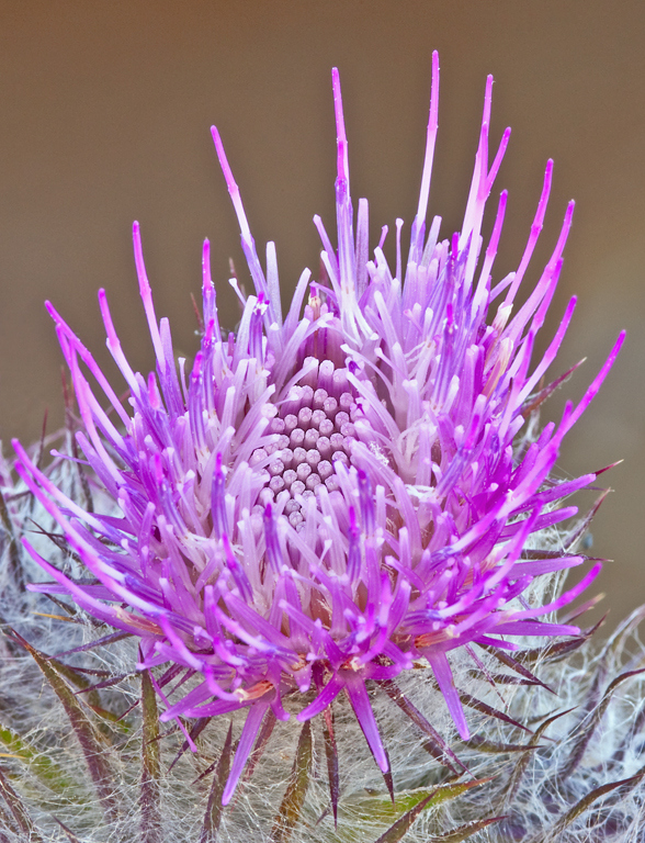 |
|
|
HM - "Avalanche Lily"
by Steve Lightle
This little flower is so super sharp
from the front that one sees pollen grains even when not
blown up. It stands out well from the muted background,
which has no distractions at all.
The lily inside the
lily is a real bonus, and the drooping orange centers
provide a nice burst of color.
This is one flower none of us has seen, and we were
pleased to see it done so well.
The back petals are slightly out of focus, but it is
a minor thing when one considers the overall impact of this
very lovely flower. 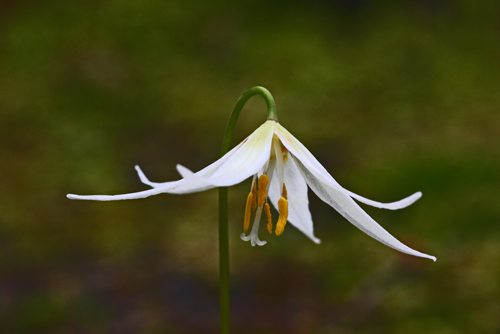 |
|